The Story Behind the Star
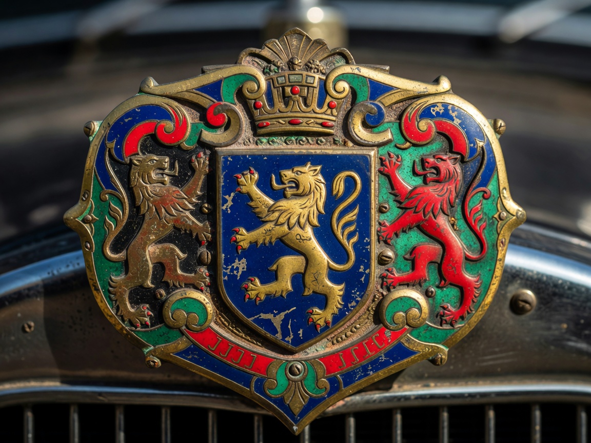
In the late 19th century, the automobile was a terrifying novelty. To grant these mechanical beasts an air of respectability, early manufacturers borrowed heavily from heraldry. The first automotive logos were essentially coats of arms, attempting to associate the greasy reality of early combustion engines with the noble pedigree of horse-drawn carriage makers.
The Heraldic Influence
Cadillac's crest, for instance, was derived from the coat of arms of Antoine de la Mothe Cadillac, the founder of Detroit. Originally, it featured a complex arrangement of merlettes (mythological birds without legs or beaks) and a crown. It was an intricate, difficult-to-reproduce badge that screamed old-world luxury.
Alfa Romeo
Adopted in 1910, the logo combines the red cross of the municipality of Milan with the Visconti serpent (Biscione) swallowing a human figure, a direct lift from 11th-century heraldry.
Porsche
Designed in 1952, long after the pioneer era but deeply rooted in it, combining the coat of arms of the Free People's State of Württemberg with the crest of Stuttgart (the black horse).
The Pragmatic Typographers
In stark contrast to European heraldry, American mass-market pioneers leaned toward pragmatic typography. Ford's logo evolution is a masterclass in this. Before the blue oval, Ford used an elaborate Art Nouveau border. It was Childe Harold Wills, a friend of Henry Ford, who brought the distinctive script font, originally used on his own business cards.
"The early automotive emblem was a battleground between aristocratic aspiration and mass-manufacturing reality."
As manufacturing processes scaled, the need for easily cast, stamped, or enameled logos became paramount. The intricate crests began to lose their fine details, slowly morphing into the bold geometric shapes that would dominate the mid-20th century.
Explore the Golden Era